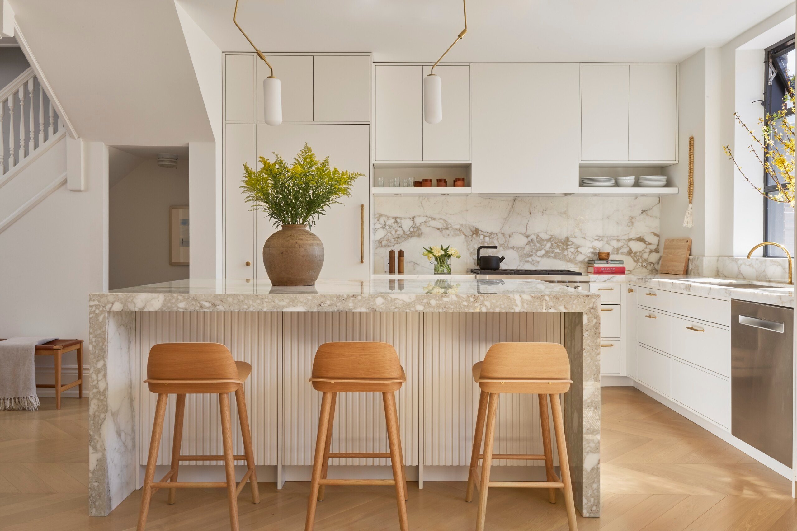
If you really think about it, our homes go through the same life stages as we do. Your home is a safe haven for you and your loved ones, which will no doubt evolve as you do. A home for newlyweds, for example, may be much different than a home for a family with young children. There are surely tiny fingerprint smudges and toy chests to prove it! In this case, Sam Sacks of Sam Sacks Design gave a detached Edwardian in downtown Toronto some much-needed love and care after the homeowners’ three children had grown from toddlers to teens. As their children became more independent, the couple was ready for a space to entertainâand Sacks certainly delivered.
Sacks, a mother of three herself, loves designing for families. Ahead, she shares how she deftly created space for elevated dining and entertaining, while still maintaining a family-oriented feel for her clients. Read on for all the expertise and inspiration.
Take a Tour of This Sun-Soaked Edwardian Home
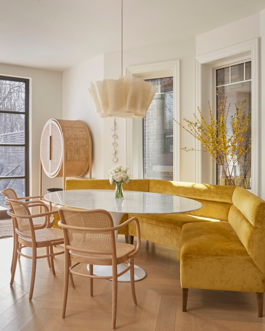
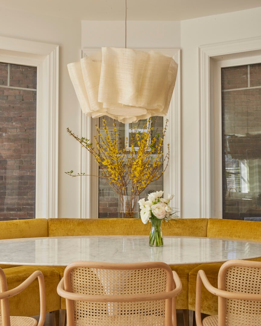
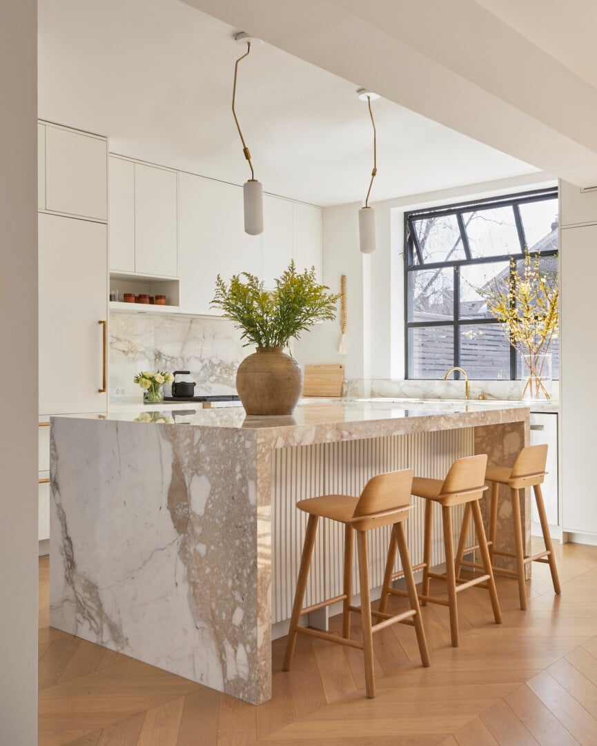
Sam Sacks Design tackled this project with utmost care. Life with toddlers and a beloved beagle had left the floors scuffed and kitchen cabinet hinges in rough shape. Sacks added new chevron floors, crisp white traditional cabinetry, and notably, two large glass doors that open up to the garden. The sunny main floor is now even more fit for comfy breakfasts (the banquette with gold velvet is simply stunning), happy hour cocktails on gorgeous marble counters, and cozy dinner parties with friends.
Get your Pinterest board ready as we take a tour and chat with Sacks about her design process!
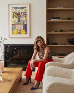
Sam Sacks
A former magazine editor and consummate storyteller, Sam’s work reflects a deep understanding of her clientâs needs, paired with a fundamental knowledge of architectural history, and backed by wild inspiration. A mother of three, Sam gets kids, loves decorating for families and knows how to design around a hairy dog.
What inspired the renovation? How did you envision the transition from a family-centric space to one focused on entertaining?
The home is really very family-centric stillâitâs open plan and thereâs a banquette for dining, but as the kids no longer needed an arts and crafts center at the kitchen table and toy storage on the main floor, the parents also were able to move into a more grown up stage of their lives. This meant a chic bar for entertaining and furniture that didnât need to be bomb proof!
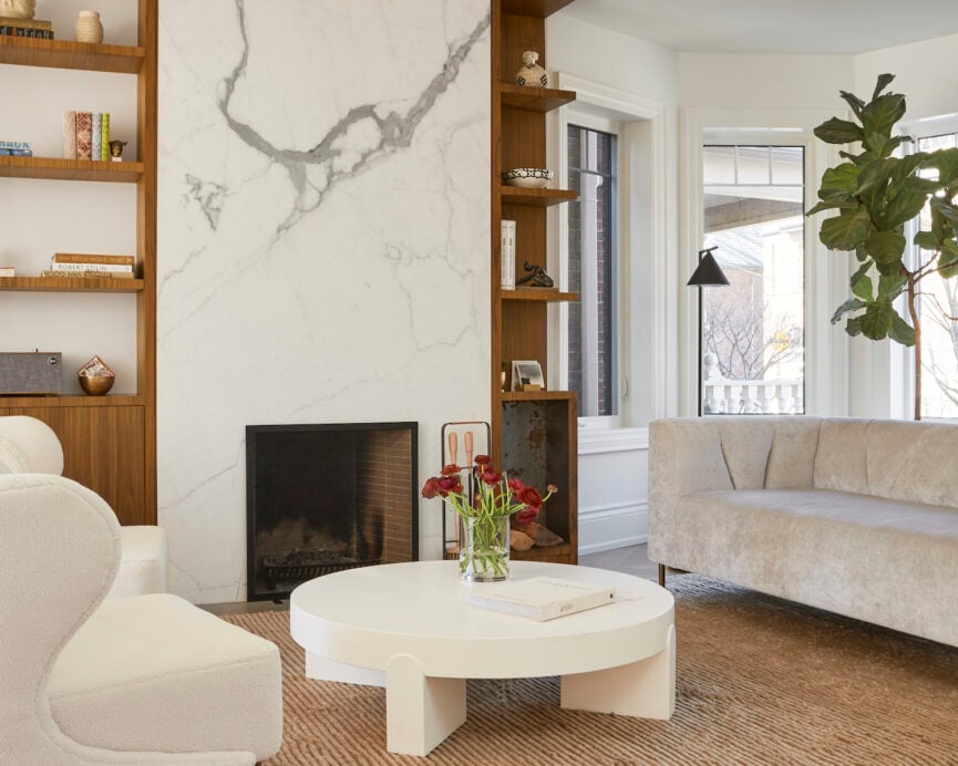
How did you balance the need for modern functionality with the home’s traditional charm?
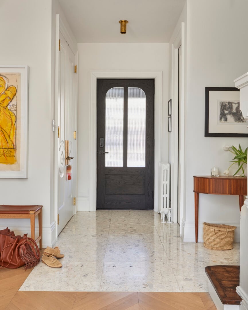
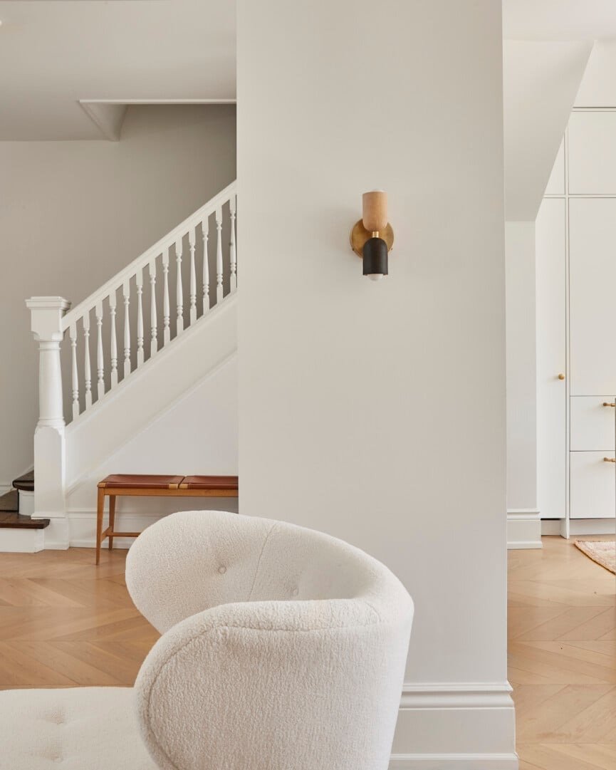
The Edwardians were essentially retrained Victorians, meaning that the flourish we love in Victorian homes was paired back. We kept the clean lines in this home, but added some flourish with a sophisticated chevron floor. We know we were still dealing with kids here, so there is a hardwearing terrazzo in the entry to help deal with the mess of winter boots in snowy Toronto winters.
The home’s color palette is both elegant and inviting. How did you choose these colors and materials, and what was the design intent behind them?
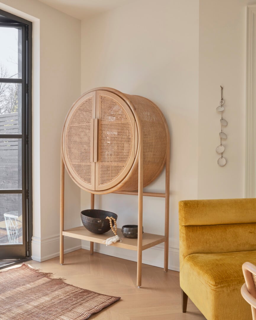
We wanted calm and pretty for these clients, so we selected mauves, blush, golds and soft creams as the palette. They are meant to create mood, but not overwhelm. To keep the space from reading overly feminine, we used factory windows and doors at the rear.
Can you walk us through the transformation of the garden opening and how the new design influences the flow between indoor and outdoor spaces?
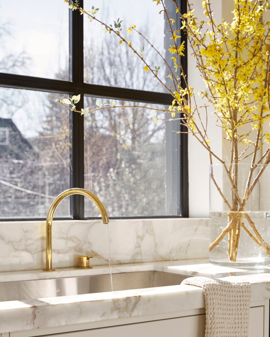
There were very basic French doors to the garden here at a standard height of 80â. We increased the width and height of the opening to create a dramatic view to the garden beyond. In the kitchen, the window actually sat below counter height, meaning that there was cabinetry running along this section of the wall. We raised the window up, but also made it higher so there was no loss of glass. By removing the casing around the window and replacing it with a drywall return, we introduced a modern element and maximized the size of the window.
What were some of the biggest challenges you faced during this renovation, and how did you overcome them?
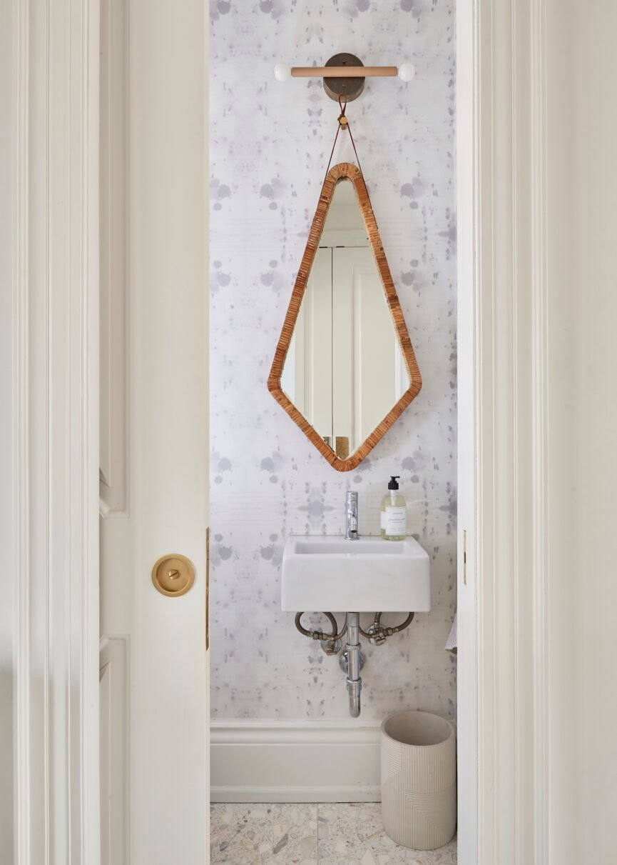
A renovation is much more challenging than a new build in that you are working with existing elements. We had a support beam in the center of the home and another across the ceiling over the kitchen island. They all needed to look natural and tie into the design elements. We built the pantry cabinetry around the ceiling beam and added lighting to the vertical support beam. This helped it look deliberate rather than an afterthought. Similarly, finding a mirror narrow enough for the tiny powder room was a struggle!
How did you ensure that the updated design reflects the needs and lifestyle of the homeowners, especially as they transition into this new stage of life?
Iâm a mother of three, mine are now making their way out of the nest (and some are coming back home to roost!) but no matter what, for family life, Iâve pretty much seen it all. I know what itâs like to live with toddlers. People often think their lives will only ever be crayons on the wall and toys on the floor. Part of my job is helping them design for their next stage of life.
Looking back on the completed project, is there a particular feature or element that youâre especially proud of?
I adore how quiet this kitchen is, but endlessly interesting. I am always doing something I havenât done before. My firm is a design laboratory more than anything, Iâm incubating new ideas and Iâm always a little panicked before theyâre installed. Will they be enough? Will the hardware, cabinet profiles, gables, depths, stone, plumbing fixtures and lighting do everything I hope it will? In this case, the answer is a heartfelt yes!

