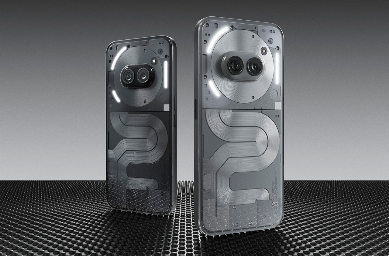
Nothing is taking its budget-focused Nothing Phone (2a) to the next level. The company has taken the wraps off the Nothing Phone (2a) Plus, a device that’s built to offer better performance and an enhanced camera in a still very affordable and very stylish smartphone. The new device is not only better under the hood, it keeps the overall design aesthetic that Nothing has become famous for in the smartphone industry. The transparent tech approach cuts through in a world of boring black slabs.

Nothing Design Sure Is Something
The Nothing Phone (2a) Plus doesn’t necessarily look all that different from the standard Nothing Phone (2a); however, that’s not necessarily a bad thing. Nothing has been building interesting-looking smartphones since the original Nothing Phone (1). Core to the Nothing design aesthetic is the transparent tech look. While the device doesn’t offer a look at the actual internals of the phone, it does give the appearance of being able to look into the device rather than just at it. It’s a neat concept and certainly helps make the phone stand out more.

On top of the transparent back look, Nothing is also running full steam ahead with its Glyph interface. The Nothing Glyph interface essentially involves a series of LED lights on the back that can illuminate for things like notifications. Notification lights are nothing new in the world of smartphones, but over the past five years or so, they’ve largely gone away. It’s nice to see Nothing at least somewhat reviving them. Even the placement of the camera is unique, reminiscent of two eyes peering out from the back of the phone.
Nothing’s approach to software is unique too. The device runs Android, but it has Nothing’s software skin, Nothing OS, on top of it, complete with monochrome app icons and classic-looking widgets. For the Nothing Phone (2a) Plus, they launched a new widget in the form of the new News Reporter widget. It’s designed to leverage AI to show daily news, and you may or may not be interested in using it. But it sure does look great.

For the Nothing Phone (2a) Plus, there are two new colorways: Metallic Gray and a new black color. Both look great, but the Metallic Gray that I’ve seen in person looks particularly good. Nothing says that the frame is built from 100% recycled aluminum. Across the five circuitboards, the device uses 100% recycled tin, and on the main circuitboard, it uses 100% recycled copper foil.
The Rest of the Details
The phone is no slouch under the hood, though of course the design of it is the star of the show. Nothing has done away with Qualcomm for the Nothing Phone (2a) Plus, in favor of the MediaTek Dimensity 7350 Pro 5G processor. This chipset is coupled with 12GB of RAM, and should be able to handle everything you can throw at it in 2024.

On the front, the phone has a 6.7-inch Super AMOLED display, with a full HD+ resolution. It offers a brightness of 1300 nits, which isn’t bad, though not as impressive as some of the more expensive phones out there.
The Nothing Phone (2a) Plus has a 5,000mAh battery, that can take 50W fast charging. That’s pretty fast, and Nothing says you’ll get a day’s worth of charge in 20 minutes (though I’m a little skeptical about the brand’s definition of a day’s worth of use).

Nothing is quick to tout the Phone (2a) Plus’ “triple 50MP camera system,” though to be clear, one of those cameras is the selfie cam on the front. The device still has a main camera and ultrawide camera on the back, and they have similar specifications, but that selfie camera does have an upgraded resolution that Nothing says can deliver more crisp photos.
The Nothing Phone (2a) Plus will first be available in London, and in the United States through Nothing’s US Beta Program August 7 starting at $399. For more information, head to nothing.tech.
This post contains affiliate links, so if you make a purchase from an affiliate link, we earn a commission. Thanks for supporting Design Milk!

