With the longest platforms, the biggest tunnels and the fastest trains on the entire London underground, the Elizabeth line boasts a dizzying list of superlatives, carrying more people a day than any other train line in the country. It is now deemed to have the best design, too â being named as the winner of the 2024 RIBA Stirling prize for the finest architecture in the UK. The competition was stiff: from the National Portrait Gallery in London to the renovation of the Park Hill estate in Sheffield, from a Dorset dairy farm conversion to a street of social housing in Hackney and the 67-acre regeneration of Kingâs Cross.
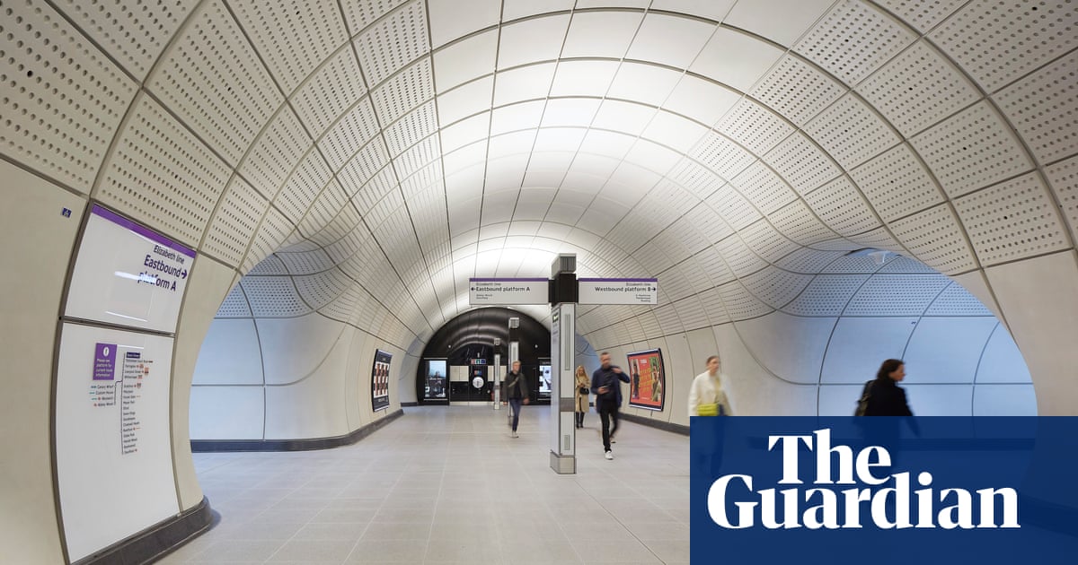
The Lizzie line is a worthy winner, providing a dazzling demonstration that, for all chaos surrounding HS2, Britain is still capable of pulling off gargantuan transport infrastructure projects with style and panache. Stepping off the escalators and entering its streamlined white tunnels is like being teleported to a parallel universe, worlds away from the rest of the creaking, sooty tube network.
From the airy, clutter-free concourses to the soft acoustic, calm lighting and clear signage, every detail has been honed to make the passenger experience as simple and stress-free as possible. It is a model of standardisation and prefabrication, built with rare precision, its effortless elegance belying the fiendish complexity of coordinating the 73-mile-long endeavour, and the transformative effect it has had on the lives of millions.
âThe Elizabeth line is a triumph in architect-led collaboration, offering a flawless, efficient, beautifully choreographed solution to inner-city transport,â said RIBA president Muyiwa Oki, chair of the Stirling prize jury. âIt rewrites the rules of accessible public transport and sets a bold new standard for civic infrastructure, opening up the network, and by extension London, to everyone.â
The prize has been awarded to the âline-wideâ design of the stations below ground level, led by Grimshaw Architects, with engineering by AtkinsRéalis, way-finding by Maynard and lighting by Equation. Different architects were responsible for each station above ground, with more mixed results. Unusually for the architecture-centric award, the other consultants have been named as equal co-designers, reflecting the collaborative nature of the £18.6bn endeavour, which led to a truly integrated result.
While other tube stations are cluttered with signs and light fittings added haphazardly over the years, the Elizabeth line has condensed and rationalised everything into a unified whole. Service âtotemsâ on the concourses â inspired by the uplighter columns of Charles Holdenâs 1930s tube stations â integrate everything from lighting and cameras to signage and speakers, as do seamless panels above the platform edge screens, all easily accessible for maintenance.
Corralling together all the gubbins means that the full volume of the tunnels can be expressed, with no need for suspended ceilings and walls to hide the services. The result feels extraordinarily spacious, with broad concourses that melt into wide cross-passages, all clad with sinuous white panels, as if the entire line has been moulded from a single substance.
The fluid geometry helps to minimise blind spots and improve people flow, and it also reflects how the tunnels were made. Rather than using iron or concrete retaining rings, which form right-angled corners as seen elsewhere on the underground, concrete was sprayed directly on to the exposed earth after excavation, creating softer tunnel intersections. This smooth, tubular world is lined with a continuous skin of white glass fibre-reinforced concrete panels, whose design was honed to reduce the number of panel types from 80 to just nine, saving costs and material â the carbon payback time should be about 10 years.
Full-size concourse mock-ups, built in a warehouse in Leighton Buzzard, allowed the design team to perfect every detail, and enabled the contractors to see what they were expected to do, and refine their own prototypes. It paid off: the result has the precise quality of a factory-made product more than a building.
after newsletter promotion
There are clever details throughout, which few will notice on their commute. The lighting temperature shifts subtly, from warmer diffused light on the platforms and concourses, to a cooler tone in the âfasterâ cross-passages, to encourage people to keep moving. Above head height, the concrete panels are perforated, with acoustic matting hidden behind to absorb noise. This adds to the sense of calm, and helps make the line accessible to those who find tube travel stressful or intimidating, along with step-free access throughout.
For all the ingenuity on show, itâs not perfect. The focus on line-wide consistency underground, and diverse âcontextualâ design at street level, seems back to front. It would make more sense for the stations to be consistent and easily recognisable on the street â like the gleaming oxblood red tiles and arched windows of Leslie Greenâs iconic Edwardian tube stations â and then different at platform level, so you can easily spot where you are from a crowded carriage. The Lizzie lineâs efficient blur of beige could do with a few more splashes of character, like Eduardo Paolozziâs mosaics at Tottenham Court Road, or Annabel Greyâs enamel panels at Marble Arch, or the slanting indigo tiled columns of Will Alsopâs North Greenwich. Instead, public art is confined to a few bolt-on baubles above ground.
Similarly, the marvel of these cavernous underground cathedrals soon fades away when you leave central London, as the line makes its way to the outer reaches of the capital above ground. An immense amount of design intelligence was lavished on the central stations, but the peripheral stops feel distinctly second class. They may sport the same regal purple roundels, but the banal boxes of Ilford and Ealing Broadway have little in the way of award-winning architecture. Was it too much to hope that the lineâs Stirling prize quality could extend beyond Zone 2?

